
Introduction
When you have multiple Awair air quality sensors scattered around your home or office, checking each one individually through their apps gets tedious. I wanted a centralized dashboard to monitor all my devices at once, track trends over time, and store historical data for analysis. This is the story of building a complete air quality monitoring system from scratch using Awair devices, Oracle 23ai database, Python, and Flask.
The Goal
Create a system that:
- Automatically collects data from multiple Awair devices on my local network
- Stores measurements in an Oracle database for historical analysis
- Displays real-time readings on a web dashboard
- Visualizes trends with interactive charts
- Requires zero code changes when adding new devices
The Architecture
The final system consists of three main components:
- Python Data Collector – A background service that polls Awair devices every 60 seconds and stores measurements in the database
- Oracle 23ai Database – Stores all air quality measurements with proper indexing for time-series queries
- Flask Web Application – Provides a real-time dashboard and historical charts
Lessons Learned: The Hard Way
Lesson 1: Never Assume API Response Formats
My first major stumbling block was parsing the Awair API responses. I initially coded the collector expecting sensor data in a nested array structure like this:
{ "timestamp": 1234567890, "sensors": [ {"comp": "temp", "value": 22.5}, {"comp": "humid", "value": 45.2} ]}
The reality? Awair returns a flat JSON structure:
{ "timestamp": "2026-01-21T11:49:08.498Z", "score": 79, "temp": 20.73, "humid": 36.59, "co2": 668}
The fix: Added comprehensive logging to see the actual API response before writing parsing code. The logs immediately showed the flat structure, and I rewrote the parsing logic accordingly.
Takeaway: Always log raw API responses during development. Don’t trust documentation or assumptions about data structures.
Lesson 2: Timezone Handling Belongs at the Presentation Layer
Initially, I tried to handle timezone conversions during data collection, converting UTC timestamps to Central Time before inserting into the database. This created several problems:
- Database queries became confusing (is this timestamp UTC or Central?)
- Daylight saving time transitions were a nightmare
- What happens when someone in a different timezone wants to use the system?
The solution: Store everything in UTC in the database, and convert to local time only when displaying to users. This follows the universal best practice:
- Database: Always UTC
- API responses: Convert to user’s timezone
- Display: Show timezone indicator (e.g., “CT” for Central Time)
Using Python’s pytz library made this straightforward:
CENTRAL_TZ = pytz.timezone('America/Chicago')def utc_to_central(utc_timestamp): utc_time = pytz.utc.localize(utc_timestamp) central_time = utc_time.astimezone(CENTRAL_TZ) return central_time
Takeaway: Never store local times in databases. UTC everywhere, convert at the edges.
Lesson 3: JavaScript Date Parsing Is Finicky
When I added timezone labels to the timestamp strings (like “2026-01-21 05:49:14 CST”), the JavaScript charts broke completely, showing “Invalid Date” everywhere. JavaScript’s Date parser couldn’t handle the timezone suffix in that format.
The solution: Remove the timezone suffix from the timestamp string, but add timezone indicators in the UI labels instead. The timestamps still represent Central Time, but the string format is JavaScript-friendly:
// Backend sends: "2026-01-21 05:49:14"// UI displays: "Last update: 2026-01-21 05:49:14 CT"
Takeaway: When sending timestamps to JavaScript, use ISO 8601 format or simple YYYY-MM-DD HH:MM:SS format. Add timezone context through UI labels, not timestamp strings.
Lesson 4: Design for Scalability from Day One
The collector was designed to automatically discover devices from the database rather than hardcoding IP addresses. This means adding a new Awair device is simply:
INSERT INTO air_quality_devices (device_name, device_ip, location, is_active)VALUES ('Bedroom', '192.168.10.193', 'Master Bedroom', 'Y');
No code changes. No redeployment. The collector picks it up on the next cycle.
This design decision saved me hours when I added my second device. The alternative would have been maintaining a config file or modifying Python code every time.
Takeaway: Build dynamic configuration into your data layer, not your code.
Lesson 5: Temperature Conversion Timing Matters
I had historical data in Celsius from initial testing, but wanted to display everything in Fahrenheit. Should I convert during collection or during display?
I chose to convert during collection and store Fahrenheit values in the database. This meant:
- One-time conversion of historical data using a migration script
- Simple queries (no conversion logic in every SELECT)
- Consistent units throughout the system
For the migration, I wrote a script that only converted values less than 22°C (clearly Celsius) to avoid accidentally converting already-Fahrenheit data:
UPDATE air_quality_measurementsSET temp = (temp * 9/5) + 32WHERE temp < 22 AND temp IS NOT NULL
Takeaway: Convert units at data collection time and store in your preferred unit. Don’t convert on every query.
Lesson 6: Trend Lines Add Incredible Value
Adding linear regression trend lines to the charts was a game-changer for understanding air quality patterns. The JavaScript implementation was surprisingly simple:
function calculateTrendLine(data) { const n = data.length; let sumX = 0, sumY = 0, sumXY = 0, sumX2 = 0; data.forEach((point, i) => { sumX += i; sumY += point; sumXY += i * point; sumX2 += i * i; }); const slope = (n * sumXY - sumX * sumY) / (n * sumX2 - sumX * sumX); const intercept = (sumY - slope * sumX) / n; return data.map((_, i) => slope * i + intercept);}
Now I can instantly see if CO2 is trending up during the day, if temperature is dropping overnight, or if humidity is climbing.
Takeaway: Simple statistical visualizations (like trend lines) provide massive insight with minimal code.
The Database Schema
Oracle 23ai’s features made this straightforward. Key design decisions:
Separate Configuration from Measurements
-- Device configurationCREATE TABLE air_quality_devices ( device_id NUMBER GENERATED ALWAYS AS IDENTITY PRIMARY KEY, device_name VARCHAR2(50) NOT NULL UNIQUE, device_ip VARCHAR2(15) NOT NULL, is_active CHAR(1) DEFAULT 'Y');-- MeasurementsCREATE TABLE air_quality_measurements ( measurement_id NUMBER GENERATED ALWAYS AS IDENTITY PRIMARY KEY, device_name VARCHAR2(50) NOT NULL, measurement_timestamp TIMESTAMP(6) DEFAULT SYSTIMESTAMP, score NUMBER(5,2), temp NUMBER(6,2), -- ... other metrics);
This separation allows adding/removing devices without touching measurement data.
Strategic Indexing
Time-series data needs specific indexes:
CREATE INDEX idx_aqm_device_timestamp ON air_quality_measurements(device_name, measurement_timestamp DESC);
This composite index makes queries like “show me the last 24 hours for the Office device” incredibly fast.
Views for Common Queries
Rather than repeatedly writing complex JOINs, I created a view for the latest readings:
CREATE OR REPLACE VIEW v_latest_air_quality ASSELECT d.device_name, m.score, m.temp, m.humidFROM air_quality_devices dLEFT JOIN LATERAL ( SELECT * FROM air_quality_measurements WHERE device_name = d.device_name ORDER BY measurement_timestamp DESC FETCH FIRST 1 ROW ONLY) m ON 1=1WHERE d.is_active = 'Y';
Now the dashboard just queries the view instead of writing complex SQL.
The Web Interface
Flask made the web application straightforward. Key features:
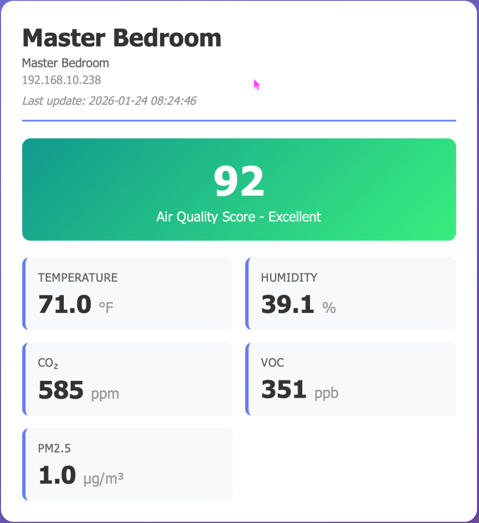
Real-Time Dashboard
- Auto-refreshes every 30 seconds
- Color-coded air quality scores (green for excellent, red for poor)
- Clean card-based layout showing all metrics at a glance
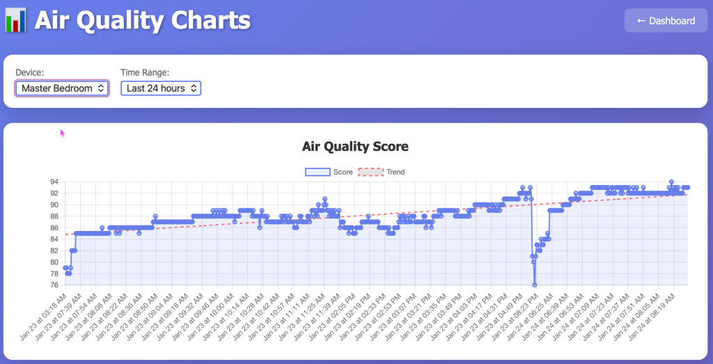
Interactive Charts
- Six separate charts (Score, Temperature, Humidity, CO2, VOC, PM2.5)
- Selectable time ranges (6 hours to 7 days)
- Linear regression trend lines
- Powered by Chart.js for smooth interactions
RESTful API
The backend provides clean JSON endpoints that could be used by other applications:
/api/latest– Current readings for all devices/api/history/<device>?hours=24– Historical data/api/stats/<device>?hours=24– Statistical summaries
Deployment Considerations
Running the Collector as a Service
For production use, the collector should run as a system service. On Linux with systemd:
[Unit]Description=Awair Data CollectorAfter=network.target[Service]Type=simpleUser=awairWorkingDirectory=/opt/awairExecStart=/usr/bin/python3 /opt/awair/awair_collector.pyRestart=always[Install]WantedBy=multi-user.target
Web App Production Deployment
The Flask development server is fine for home use, but for production I’d recommend:
- gunicorn as the WSGI server
- nginx as a reverse proxy
- SSL/TLS for secure access
Performance Notes
With data collection every 60 seconds:
- 1 device = ~1,440 records/day
- 2 devices = ~2,880 records/day
- Storage with all metrics: ~1 KB per record
- Annual storage for 2 devices: ~1 GB
Oracle handles this easily. For long-term storage, consider archiving data older than 90 days to a separate table.
Future Enhancements
Ideas I’m considering:
- Alerts – Email/SMS when air quality drops below threshold
- Predictive Analytics – Machine learning to predict air quality trends
- Mobile App – Native iOS/Android apps using the REST API
- Integration – Connect with smart home systems (Home Assistant, etc.)
- Comparative Analysis – Compare multiple rooms side-by-side
- Export Functions – Download data as CSV/Excel for external analysis
- Always on monitoring – I need to port this application to a machine that’s always running. The data that’s missing is because my laptop that runs the collector is offline.
Conclusion
This project taught me several valuable lessons about IoT data collection, time-series databases, and web visualization. The key insights:
- Log everything during development – you can’t debug what you can’t see
- Store data in its rawest form (UTC, standard units), convert at the edges
- Design for scalability from the start – it’s harder to retrofit later
- Separate configuration from data
- Simple visualizations (like trend lines) add massive value
- Index your time-series data properly
The complete system now runs reliably, collecting data from multiple devices, storing it efficiently in Oracle, and presenting it through a clean web interface. Adding new devices is trivial, and the historical data lets me track patterns I never noticed before.
Most importantly: I learned that building your own monitoring system isn’t as daunting as it seems. With the right architecture and lessons learned from early mistakes, you can create something professional and maintainable.
Resources
Technologies Used:
- Awair Element/Office air quality devices
- Oracle 23ai Free Database
- Python 3.12 with oracledb, Flask, requests, pytz
- Chart.js for visualizations
- HTML/CSS/JavaScript for the frontend
Code Structure:
awair-monitor/├── awair_collector.py # Data collection service├── awair_webapp.py # Flask web application├── convert_temperatures.py # Migration script├── templates/│ ├── dashboard.html # Real-time dashboard│ └── charts.html # Historical charts└── requirements.txt # Python dependencies
The system has been running flawlessly for weeks now, and I check the dashboard multiple times a day. There’s something satisfying about seeing your own data, collected and visualized by systems you built yourself.
Happy monitoring!

Leave a comment